Saturday, September 29, 2012

My visit to Albright-Knox

I went to Albright-Knox Art Gallery for this assignment.  I found so many art works I absolutely loved & took about a million pictures, but chose the following to answer the questions.

A.) One art work that made an impact & impression on me was this one by Sonja Braas.


It is titled "The Quiet of Dissolution: FireStorm."  (2008)  I think it made an impact on me due to all the controversy surrounding the end of the Mayan calendar & all the crazy stuff that's supposed to happen in a few months.  This particular piece is a photograph of the city of Los Angeles, with a strategically lit maquette in the background.

The next artwork that made an impact & impression on me was this one, "Maquette" by Sol Le Witt. (2005-2006)


It's the one we learned about from a video from a past assignment, & it was SO neat to see it in person!  It is titled "Wall Drawing #1268: Staricase."  The entire thing was done with graphite pencils, & you really can't appreciate the magnitude of it til you actually see it up close.  It really is impressive, in size as well technique.

B.)  The artworks that I felt a connection with are this one by Kai Althoff.  It is untitled. (2008)


I really connected to this metal birdcage, with the lion in it, because I am very interested in astrology, & I happen to be a Leo.  I really loved this particular piece.

I also connected with this piece by Lawrence Weiner. (1969)


I just thought it was such a powerful statement, & lately I've been feeling a little "marred" myself, so I was able to relate to this one.

C.)  One artist I would like to learn a little more about is Glenn Ligon.  I posted 2 shots of his untitled artwork to shot the entire piece, & then a close up to show the detail. (2002)


There is actually text in this painting from Baldwin's "Stranger in the Village," which was an essay written in 1953.  I couldn't make out what it said, so my curiosity being what it is, I plan on looking in to the essay & finding out a little more about the inspiration for this painting.

Another artist I would like to know more about is Jason Middlebrook, & his work titled "Maggots on a Steak." (2008)
 IMG_20120929_164048_zps71c3f191.jpg

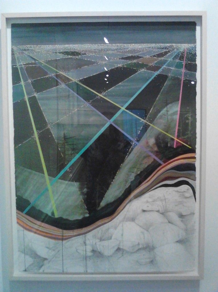
I have no idea why this beautiful painting is titled "Maggots on a Steak," but trust me, it's enough to make me want to find out more about this artist.  The cool thing about this piece is that the top half is acrylic paint, & the bottom is ink & pencil.  I really liked the use of multiple materials.

I had a blast at the gallery. Havn't been there since I was in grammer school & it was such a good way to spend a Satruday afternoon with one of my friends.

Click to add title


Wednesday, September 26, 2012

Creating My Logo


Questions 1 & 2:
I liked this project.  At first I was at a complete loss as to what to use, & how to design it. But the more I thought about it, I developed a picture in my mind of how I wanted it to be.  I am by nature a peaceful person, so I used a peace sign, & did it in my favorite color, purple.  I incorporated the letter 'M' in to the center of the peace sign to represent my name, & did that in a darker shade of purple so it would stand out.  Then in each separate section of it I drew things that represent different parts of me.  The stained glass section represents the various, diverse categories of my life, such as; being a mom, a daughter, sister, sister-in-law, aunt, cousin, niece, friend, student, & so on.  I tried to represent my eclectic personality through the multicolored, uniquely different parts of the stained glass.  Moving clock-wise around the peace sign, there's a picture of grass, sunflowers (my favorite), a blue sky, & birds. This represents my love of nature & the outdoors.  The next section has music notes, which represents my love of music. & the last section is my sad, heart-shaped crying cloud.  I'm still getting over the recent loss of a loved one, & the recent end of my engagement.  The stars represent the many nights I've spent awake contemplating life, & trying to heal.  I used colored pencils for the whole design, except for the stars.  They were a last minute addition, & yellow colored pencil wouldn't come through over the dark blue pencil, so I added them in with yellow paint at the end.
Question #3:
The most important information I learned from this project is that getting started is the hardest part.  I had a general idea of what I wanted to incorporate in to the design, but no idea how to get started.  But I found that once I sat down & started getting my ideas down on paper, it just flowed after that.
Question #4:
The PowerPoint gave me insight into my drawings & their deeper meaning.  I already had my ideas in my head, but reading about the representation of them, & seeing how accurate some of it really was, was interesting.  The video on graphic design showed me that it is important to have a logo that can work on all formats, like plastic, ceramic mugs, etc.  It also showed me the importance of using a strong design to capture the essence of what the logo is representing.  I also found it interesting that most of the large design companies for logos still start off the process of designing something with just a pen & paper.  

Thursday, September 20, 2012

Value Scale & Subtractive Color Theory Color Wheel


I really enjoyed the process of creating the color wheel & the value scale.  This class is a lot of somewhat time consuming work, but I'm finding myself enjoying the projects immensely.  They give me the opportunity to do things that I normally don't have time to try.  I got some really cool art supplies this week, & know that I will continue to experiment with them even after I have completed this course.  I found the process of creating the color wheel a bit more fun than the value scale, due to the medium of using paints.   It was fun to mix the paints to create new colors on my little paint pallet.  The value scale was interesting though, too.  I used charcoal pencils for this process.  The most important personal discovery in the creation of these studies was that I love doing this.  The most important over-all discovery that it is somewhat difficult to make a value scale.  I found the slight differences in the shades sort of difficult to put on to paper.  One important thing I learned from the video on value scales was to use a piece of paper to cover each block when it was completed, but since I used charcoal pencils instead of graphite as was used in the video, it didn't work as well & was still somewhat smudgy.  The most important thing I learned from the color wheel video is that we were all taught the wrong primary colors when we were young.  I found both the videos interesting & used the techniques they showed in the creation of my projects.

Thursday, September 13, 2012

Blog on videos about color


Questions and Topics for Your Blog Posting:
1. Describe Color and it's effects on emotions. Use the appropriate vocabulary of color in your posting.

None of the visual elements of art give us as much pleasure as color.  Color theory, properties, & harmonies, as well as light & pigment, are all factors in art.  Color has also been liked to affects on a wide range of psychological & physiological responses in people.    

2. What is a theoretical aspect of color that most intrigues/fascinates you? Why?

 Red is often used in restaurants because it has been shown in tests to increase appetite, therefore stimulating customers to eat more.  But in Van Gogh's painting of a cafe interior, he used the combination of red & green, which we often associate with Christmas, as a representation of going mad.  He thought the clash of colors was unnatural, & invoked terrible feelings.  Blue can be said to have a calming effect because it is a "cool" color.  But blue can also be linked to sadness, royalty, or have religious connotations.  So each color evokes a different response based on each person's individual responses to that color or associations with the color.  I find this interesting because 1 person may find the color red, for example, terror-inducing due to some past experience with the color involved, whereas another person can look at the same thing, & see beauty. 

3. In the Color video, what made the biggest impact on you in regards to color and it's effects on emotions?

The Color video didn't really have any 1 thing in regards to color & its effects on emotions that really stood out to me.  I did find it interesting that the Scottish painter, June Redform was very unhappy with the 1st painting she did at her home.  She said something like "I hate the colors." & complained about how the blue stood out in her eyes so strongly.  I kind of liked the 1st painting, & thought the blue looked good.  I also liked the historical explanation of the making of the pigments for paints.  Burnt sienna & raw umber were made literally from the local earth, & were extremely cheap to make, whereas Carmine red was imported from Turkey & made of crushed beetles, & ultra marine was the most expensive & made in Afghanistan. 

4. In the Feelings video, what made the biggest impact on you in regards to color and it's effects on emotions? 

In the Feelings video the part that most interested me was how historically most art was about religion & royalty.  These 2 topics depicted all emotions; from happy, to sad; from emotional anguish to physical pain. But as time progressed through the Enlightenment era, not only was color used to show & cause emotions in artistic expression, but new techniques of darkness, space, light, or stance were used to heighten these emotions even more so.  This time period also marked when art stopped being just about religion & royalty, & became about everyday humanity as well.  It was beginning to be shown that not only does religion & royalty have emotions that were "art-worthy," but everyday regular people did as well.

reflection on creating slideshow

Loved this project! At 1st it seemed a little overwhelming but it ended up being a lot of fun! Had my neighbors & son helping me by posing in some of the pictures & they had a blast too.

So i simply named my slideshow "Elements & Principles of Art." Ill give you just a brief description of each picture & the reason I chose each.
1.) Line: This picture of the train tracks & the telephone lines show movement. From the angle the picture was taken (from on the tracks), u can almost feel like you're on the train, rushing along the tracks, watching the telephones rise to each pole, then dip, then rise to the next pole.
2.) Shape: The bowl of beach glass represents shape, because it is sort of a triangle shape, but also has rounded edges, so u see "triangle"....but only sort of. It's more of an implied shape.
3.) Mass: I used the photo of the bridge to represent mass because the bridge is a 3-dimensional form that occupies a volume of space.  You can tell the bridge 3-dimensional because it casts a shadow, & you can see the width, height, & sides of it.
4.) Light: The picture of the sky represents light in the sense that it simply glows through the clouds. It is a very beautiful & awe-inspiring picture.
5.) Color: I chose the picture of the visual effects from a concert I went to because it shows the versatility of the color red.  The text book talks about the emotional effects of Munch's use of red in "The Scream" (which I have hanging in my hallway), & how it represents intensity, horror & anguish.  In the picture I chose though, that isn't the feeling that was projected in the use of the color red.  There were what looked like ruins in front of the barely visible image of the setting sun, & the feeling I got when looking at this was quite different that the horror & anguish in "The Scream."
6.) Texture: The picture of butters the puppy & the grass represents texture because when I look at it I feel like I can feel the lush green grass under my feet, & just by looking you can tell how soft this little guy is.
7.) Pattern: I used the picture of the stones in the water for pattern because even thought they are not all the same size, shape & color, they repeat seemingly endlessly in a beautiful pattern of colors.
8.) Space: The picture of the road represents space because the picture had depth, & the road ends at a vanishing point in the distant horizon.
9.) Time: I used a picture of the 100 stairs in Chestnut Ridge park to represent time because they have been there for ever, & you can see the missing bricks & erosion that have happened over time.
10.) Motion:  The picture of my brother's dog Corto was a total fluke, & I somehow got him shaking his head so fast it created a swirling effect in the photo representing motion.
11.)Unity: I used the wine bottles in front of the wooden shed because they are the same height, color, & thing, & the shed is repetitive wooden slats.
12.) Variety:  The picture of the beach glass & stones on the black bandanna show the variety of shapes, sized & colors in the rocks & glass, & the black bandanna against the lighter shades is a strong contrast.
13.) Balance:  The wood wind chimes represent asymmetrical balance because all the different chimes hang at different levels.
14.) Emphasis:  In the picture with the floating beach ball, the sun, & the hands about to clap emphasis is portrayed by the fact that all the emphasis is on those 2 items in the picture, but the rest of the crowd are still important elements, although they sort of fade into the background.
15.) Subordination:  My son Payton in the trees shows subordination because the trees are in the foreground, but Payt is thing your vision focuses on, so the trees, although prominent, become secondary.
16.) Scale: Butters the puppy & the enormous tennis ball represent scale because the normal size of a tennis ball would be small in comparison to even a puppy, but the scale of this ball to Butters is abnormal.
17.)  Proportion: The bushes represent proportion due to the fact that they are the same type of plant, but 1 is larger than the other 1.
18.) Rhythm:  The stone stairs represent rhythm because when you look at it you can almost feel yourself running up them to the rhythm of stair-climbing

I really enjoyed this project & I hope you enjoyed my explanations for my picture choices, because I had a lot of fun putting this together.

Wednesday, September 12, 2012

video blog
Submitted by Eustace, Molly (eustacma01) on 9/8/2012 5:14:32 PM

Molly Eustace

5:13 PM  -  Public
 
In the videos I learned that throughout time, aesthetics, or what had been considered beautiful has changed, from era to era.  Religion & societal norms for each time period have greatly influenced art.  All beauty is subjective, & there is no exact science to what is considered beauty.  To quote the old adage..."beauty is in the eye of the beholder."

I feel that Alexander Baumgarten's theories on philosophy was the most important. He was born in the 18th century at the height of the Enlightenment. He is most recognized for coining the word "aesthetics." Baumgarten believed that art & beauty belonged to a middle ground between sense & reason. He theorized that art leads us from the merely sensible, to a light of rational understanding. He is well known for his influence on another philosopher, Emmanuel Kont, but they didn't agree on certain aspects.

The videos give a more detailed historical view of the theories behind aesthetics, & agrees with the textbook that aesthetics can differ from person to person, & throughout history.  The movies explain how time period & perception can influence what is acceptable in art.  I really enjoyed the films but despite the importance & validity of the points made, found them to be a bit repetitive.
mollyeustace.blogspot.com
Sep 1, 2012  -  Public
 
I aldeary had a gmail account so i just used that 1. Did not like the process of setting up the blog.  I hope to increase my general knowledge & understanding of art throught this course.  I like taking online courses, but do find I have a tendancy to put things off a little longer than with a regular class. I plan on working on this issue with this class.

Saturday, September 1, 2012

created this blog for my art class....let's c how this goes.... :)